Bivouac has designed a number of Annual Reviews for the Wiener Holocaust Library, each with a unique concept relevant to their work in that specific year. Each document is thoughtfully and carefully developed to create an end result that is attractive to supporters and funders, and showcases the Library’s many successes (and in some cases, challenges).
………………
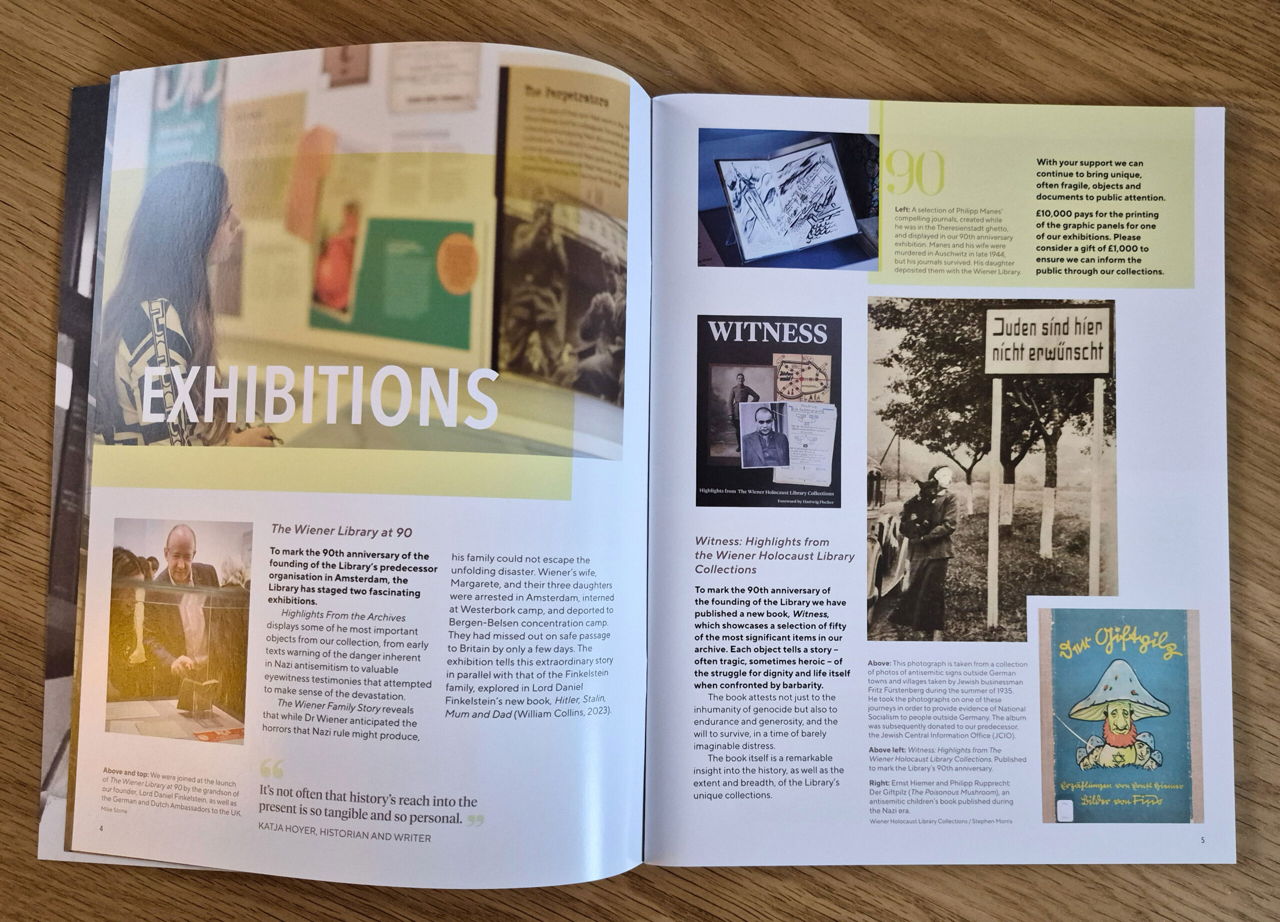
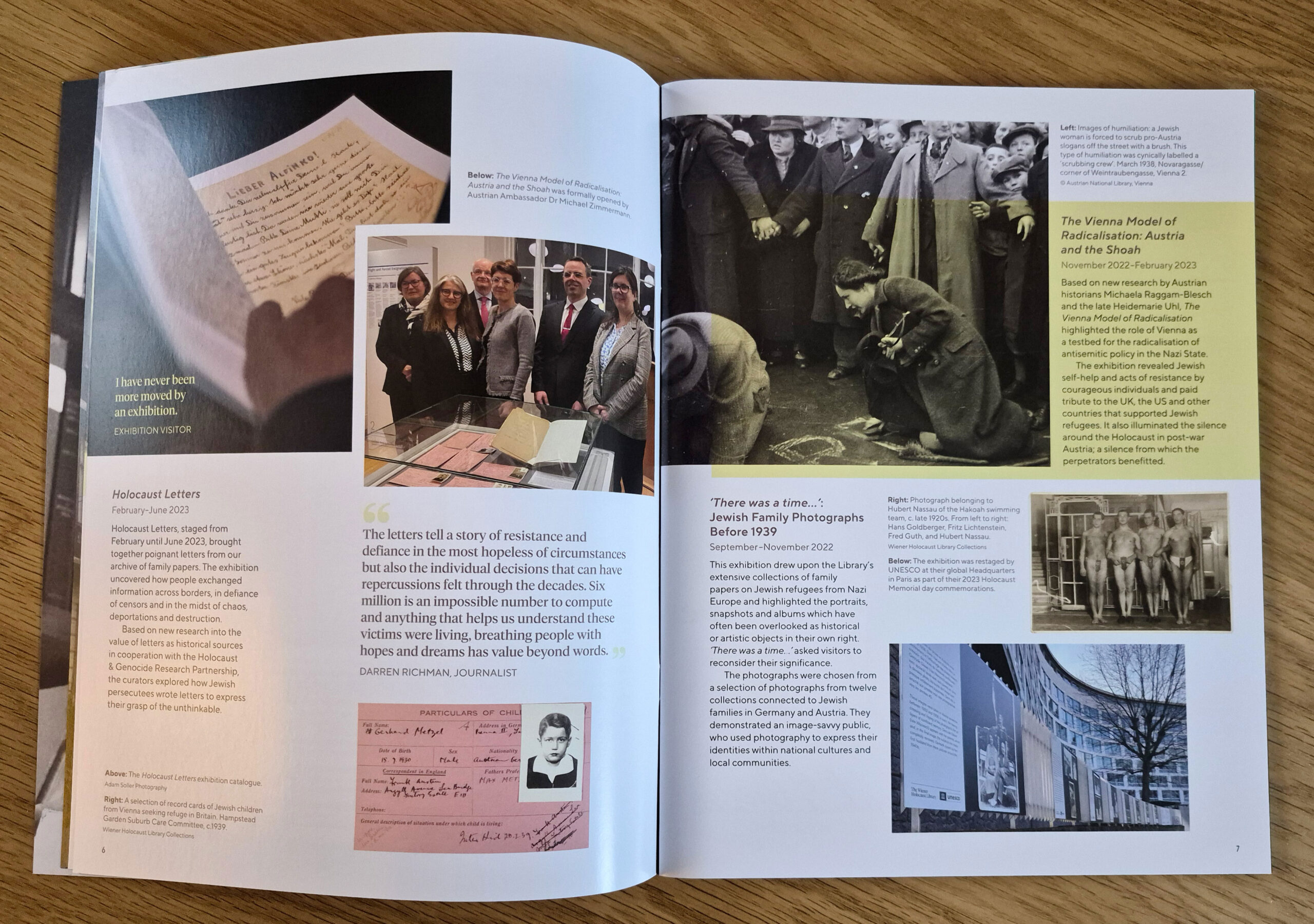
2022–23
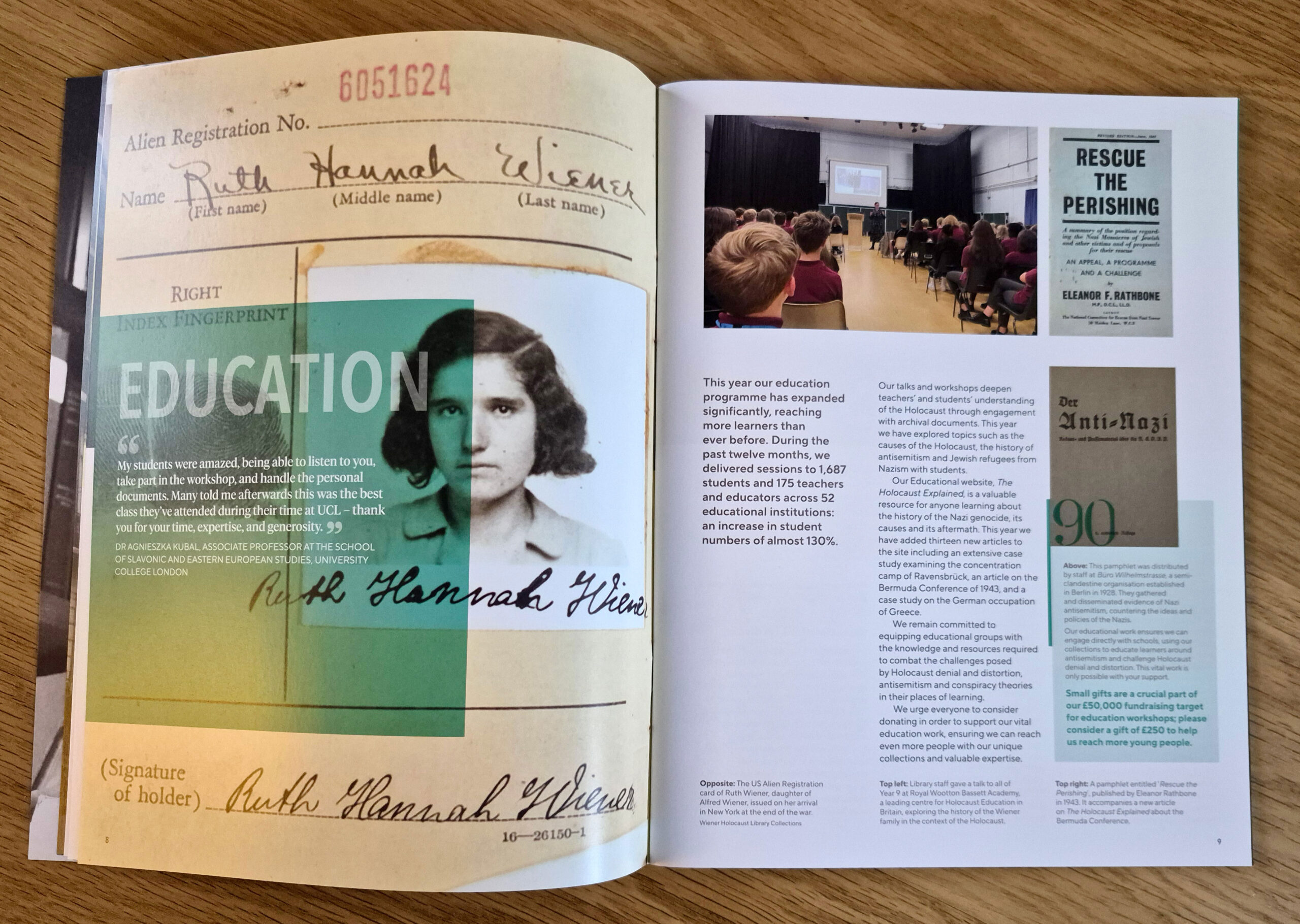
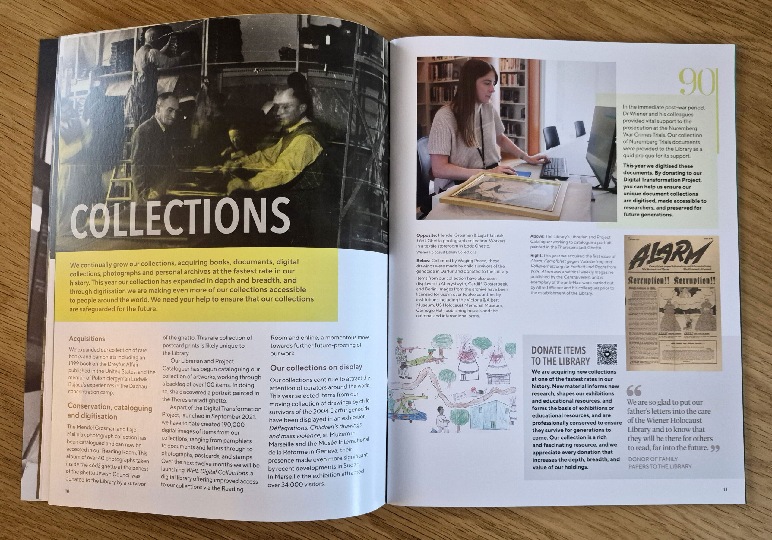
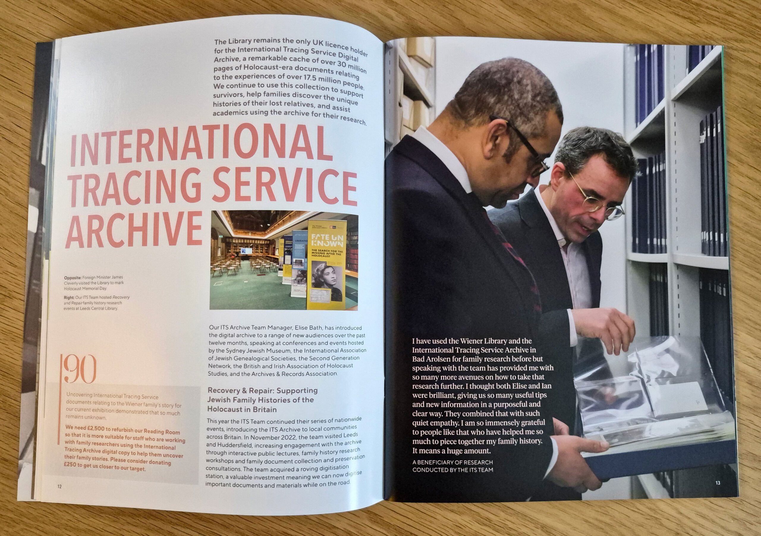
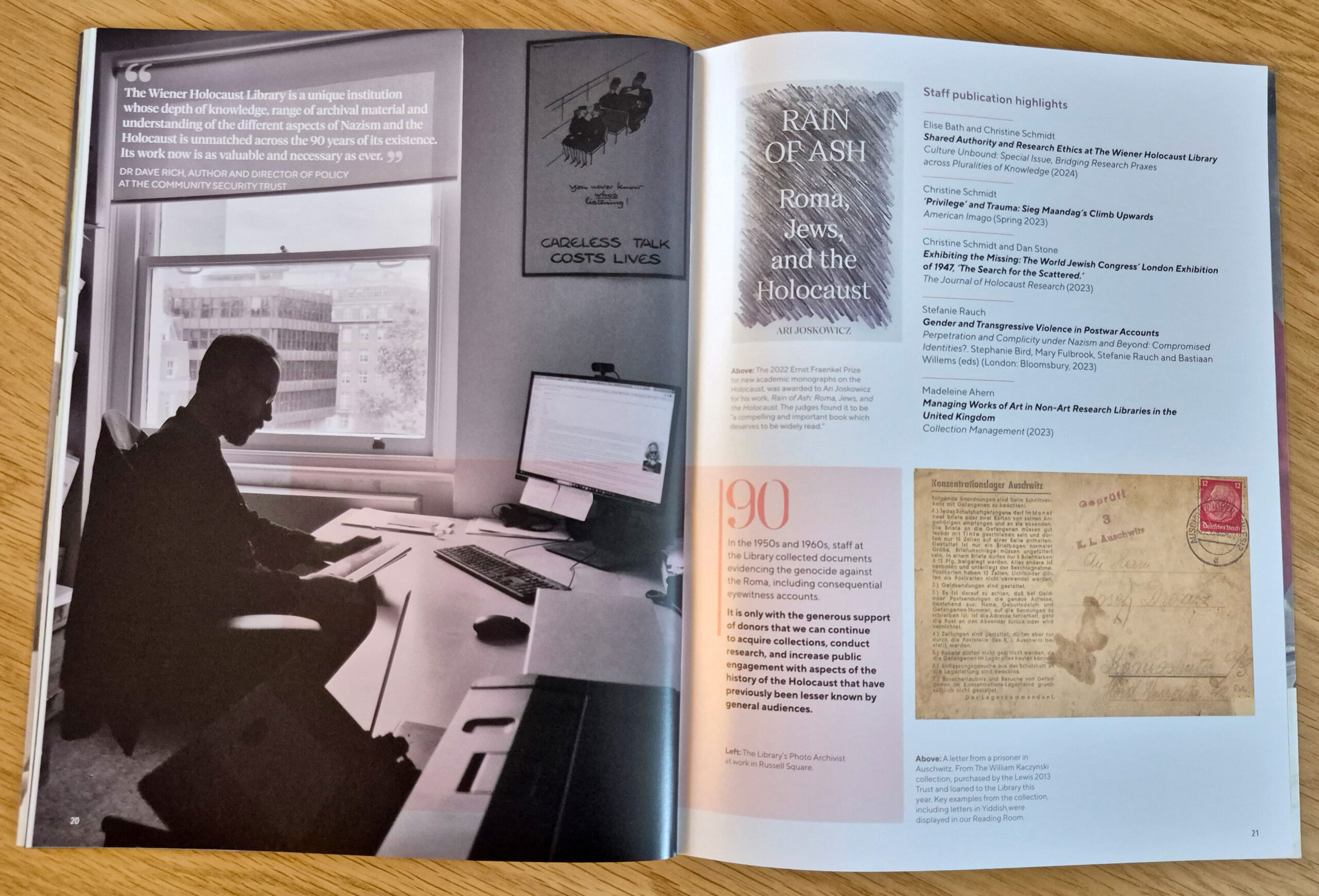
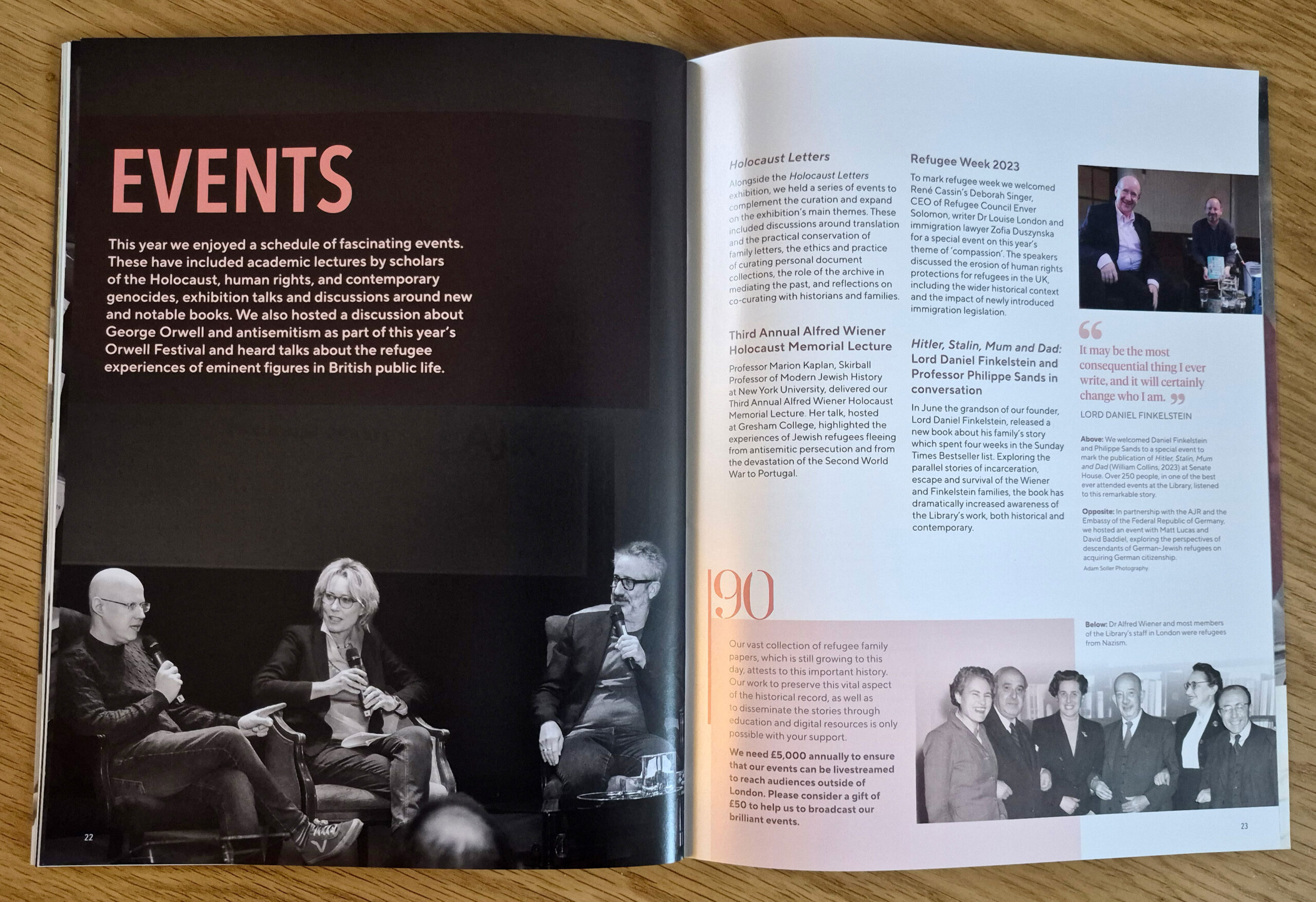
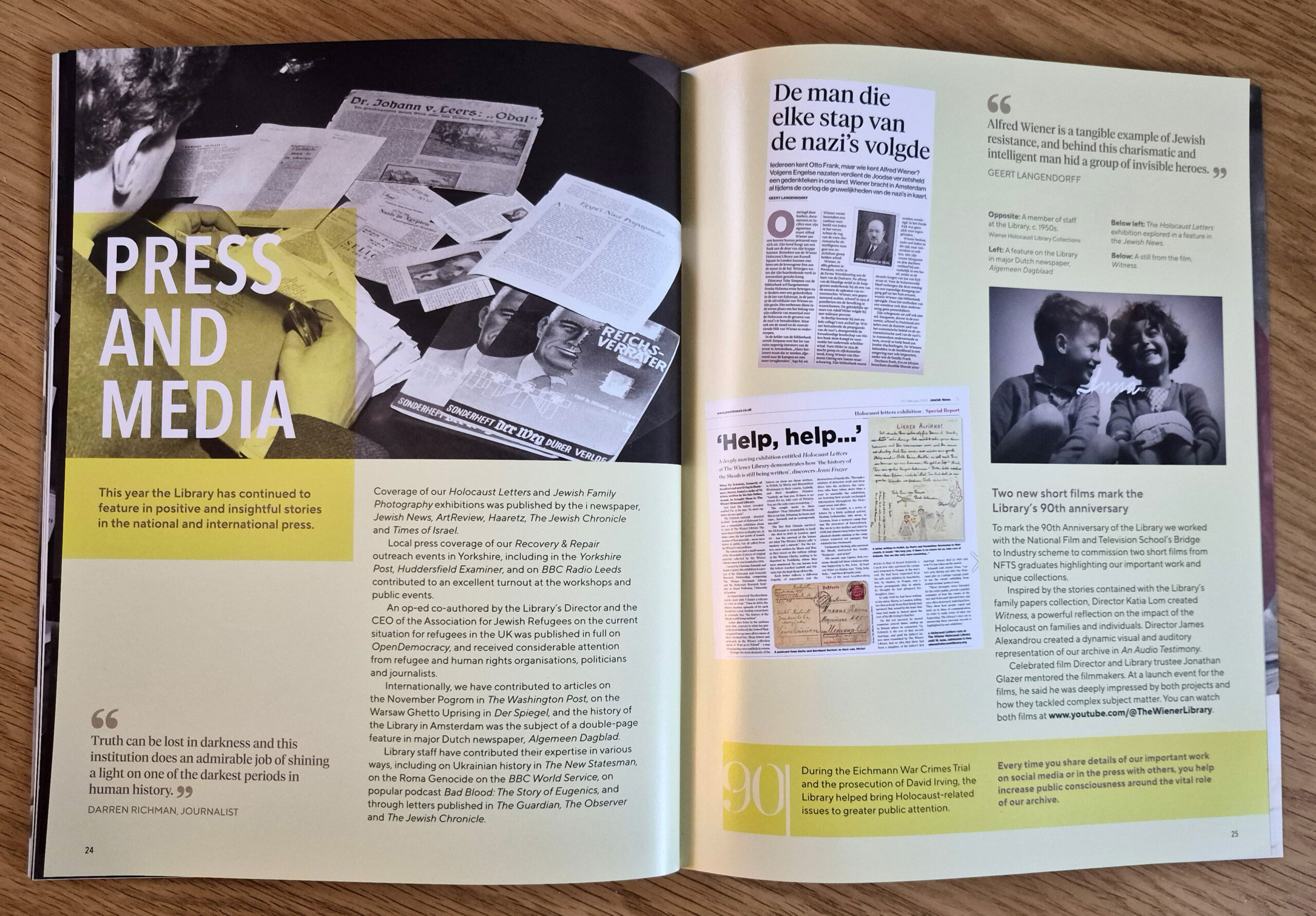
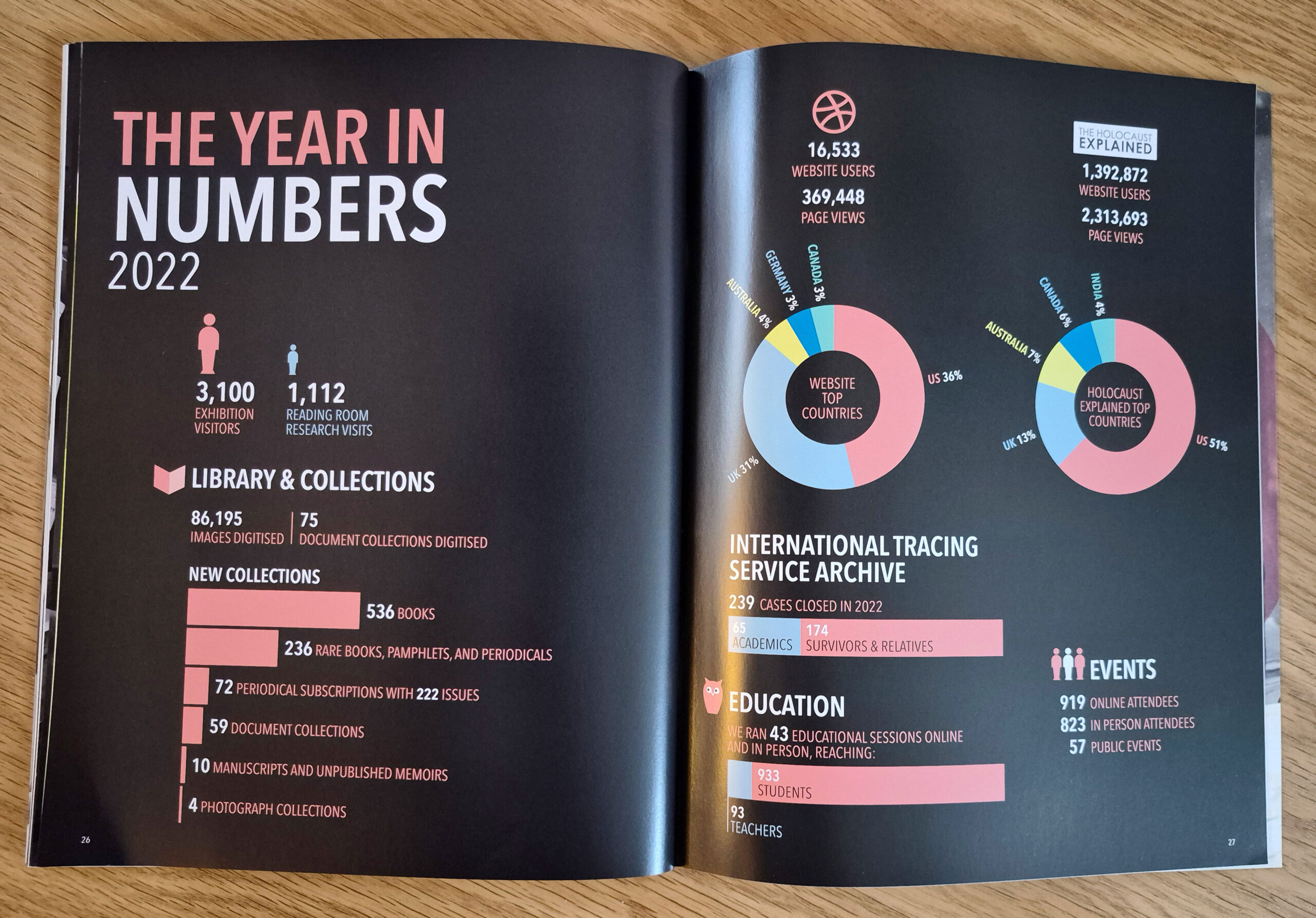
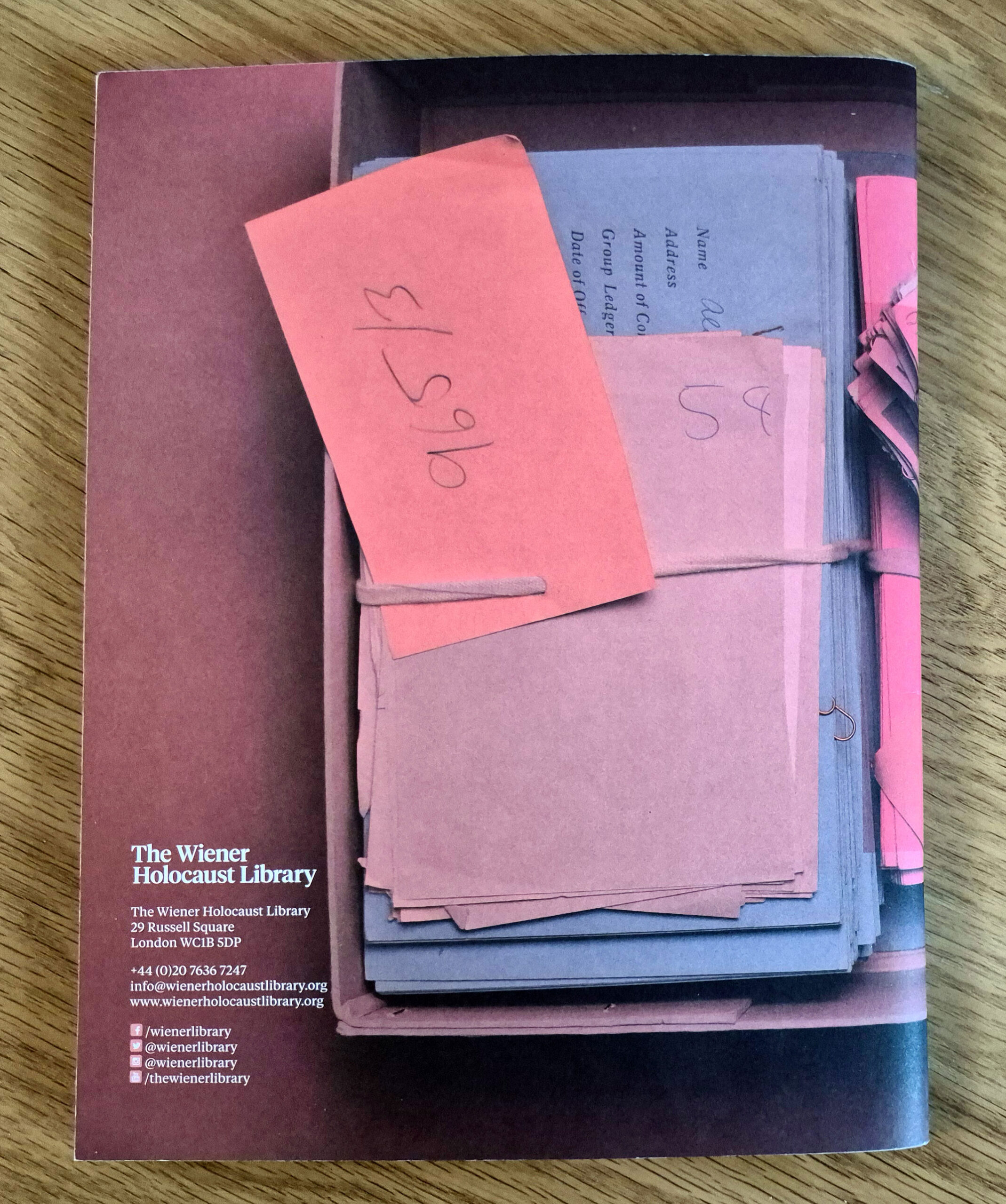
The Wiener Holocaust Library’s 2022–23 Annual Review was conceived to be a more editorial approach than in previous years.
Larger in format with uncoated covers and silk inners, the design reflected the graphic scheme of their landmark Wiener Holocaust Library at 90 exhibition (also designed by Bivouac).
Front cover
A selection of spreads are shown below:
………………
2021–22
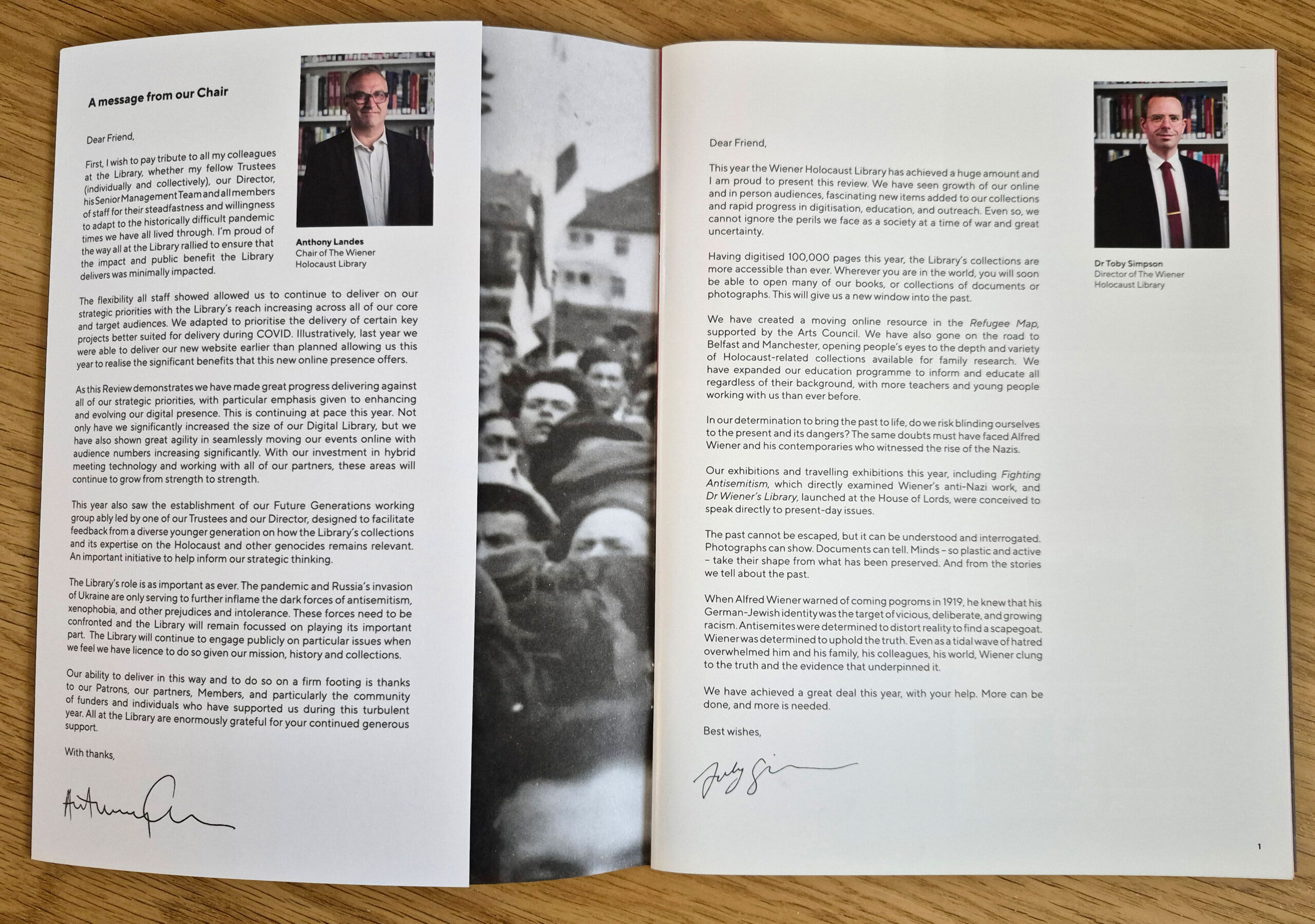
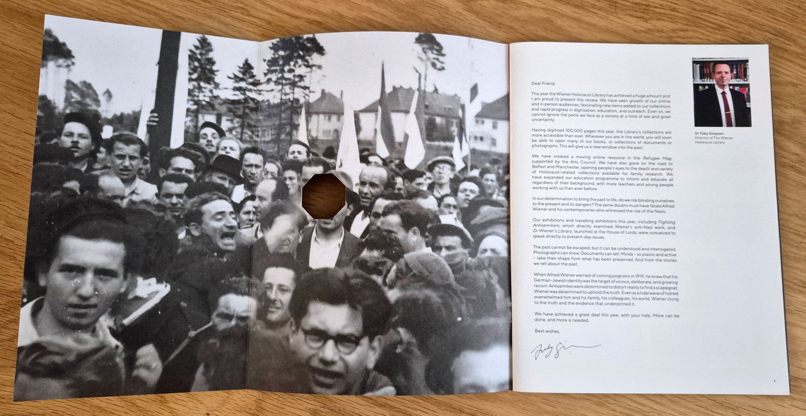
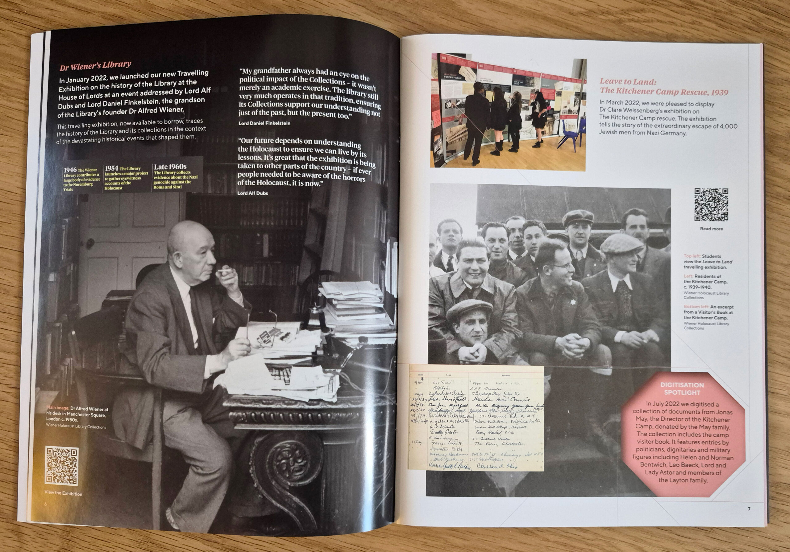
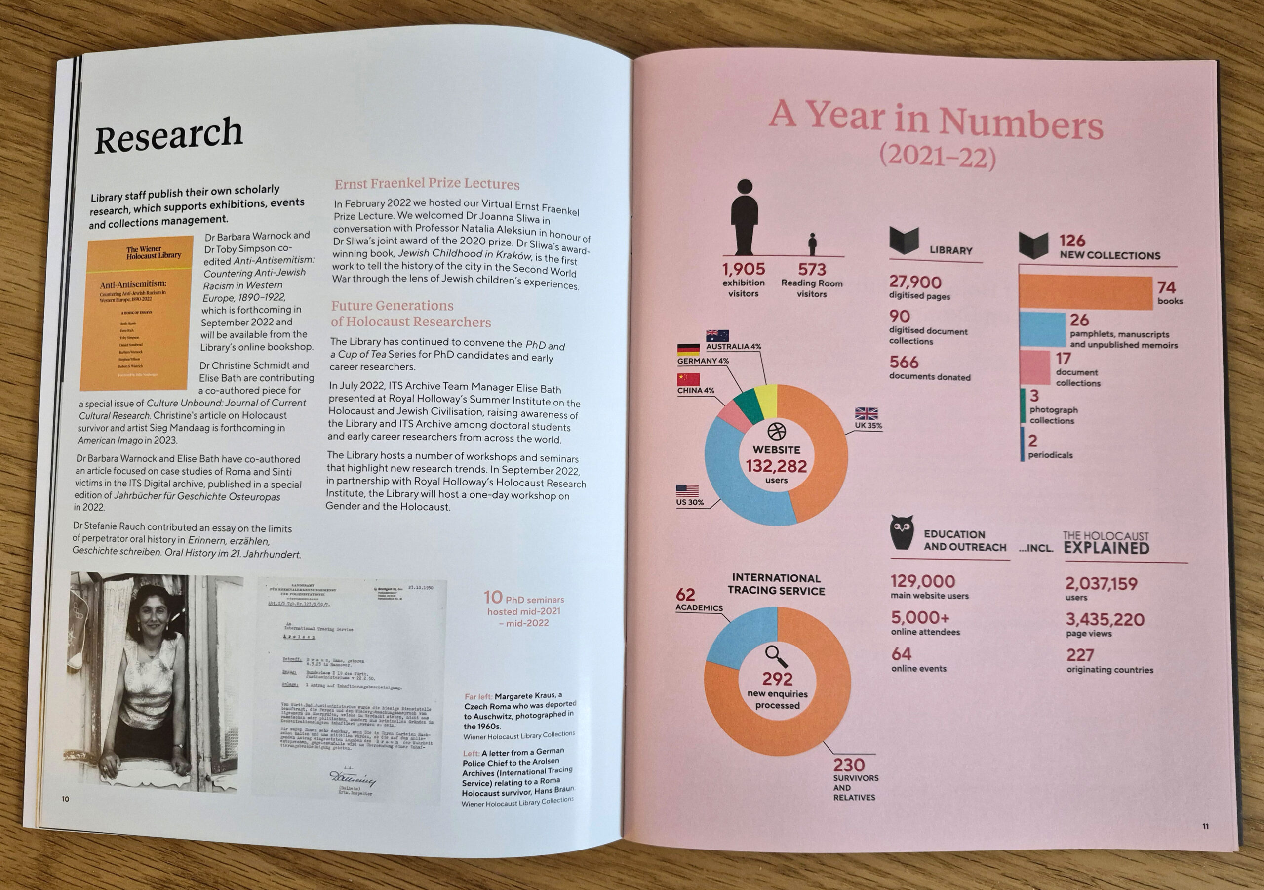
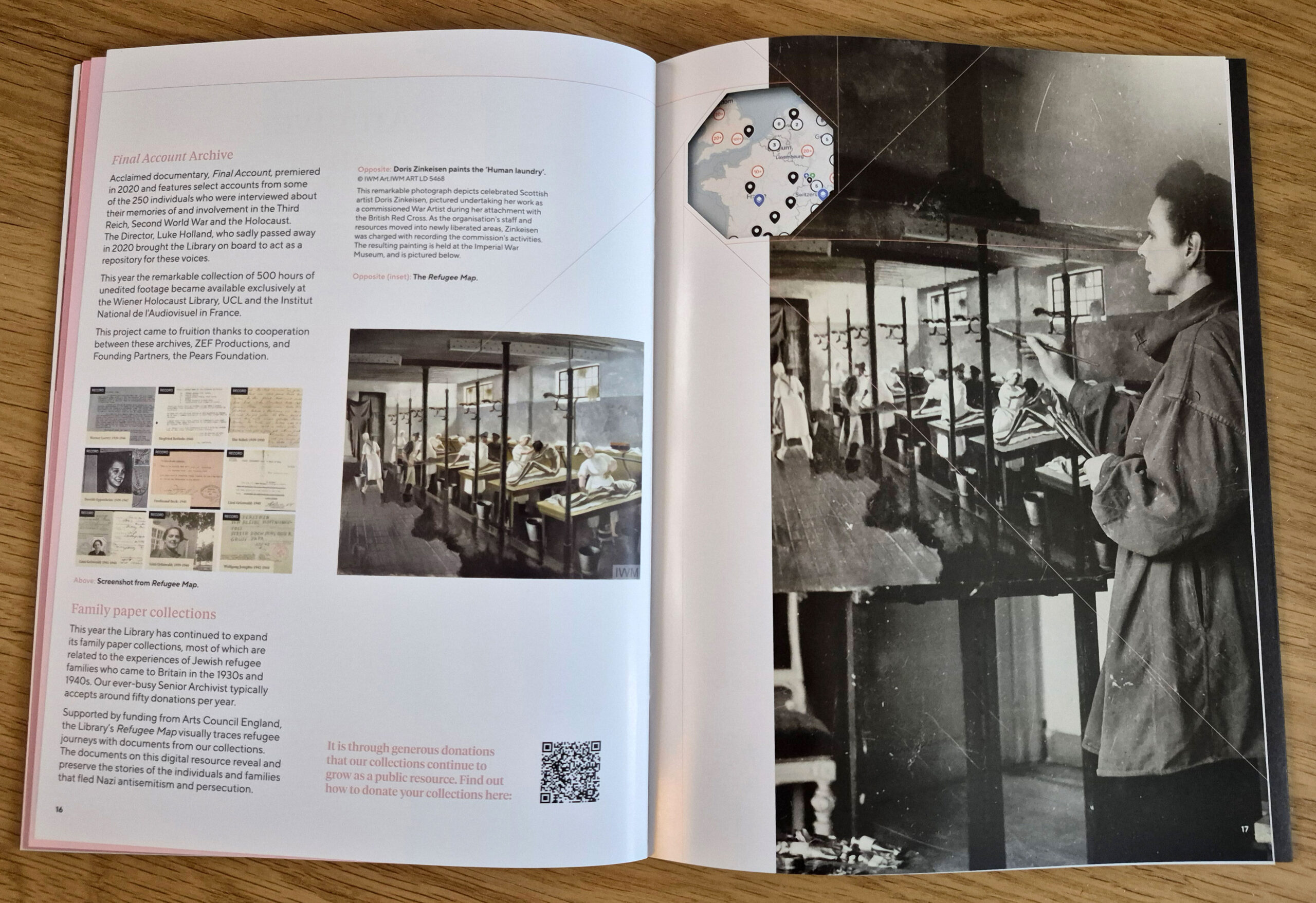
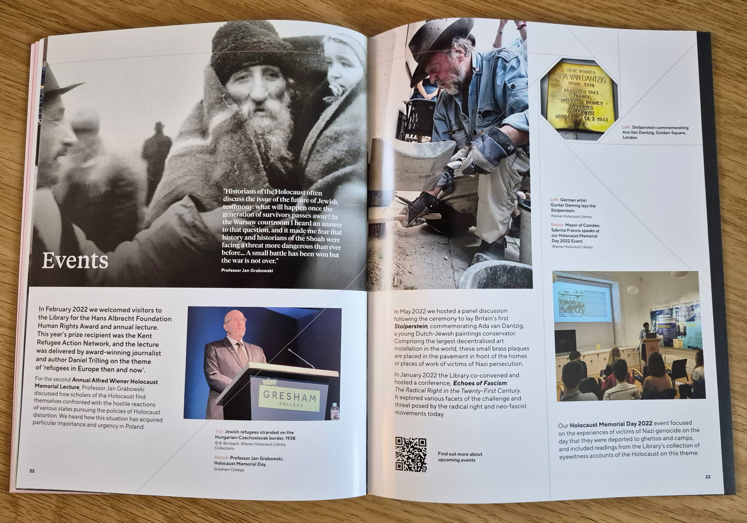
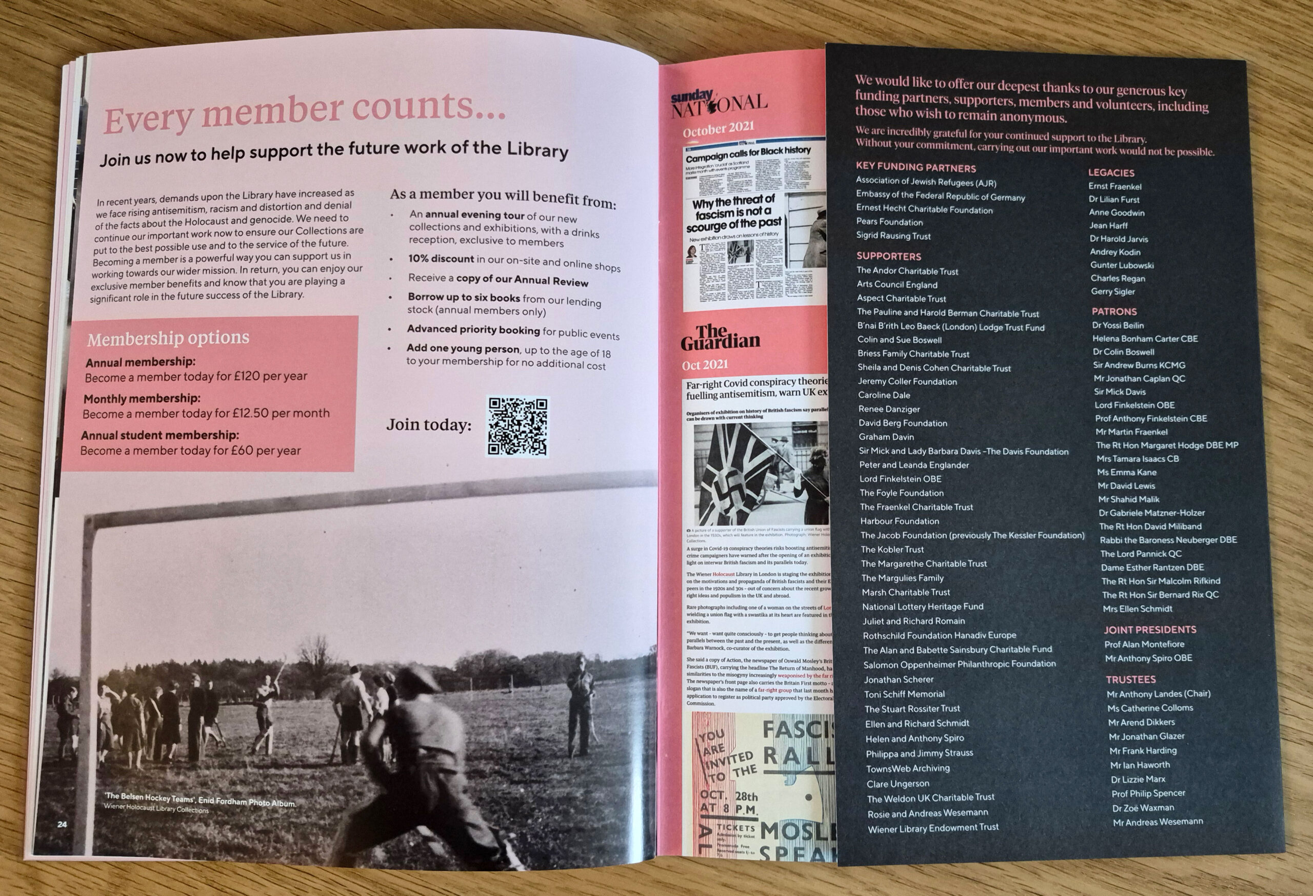
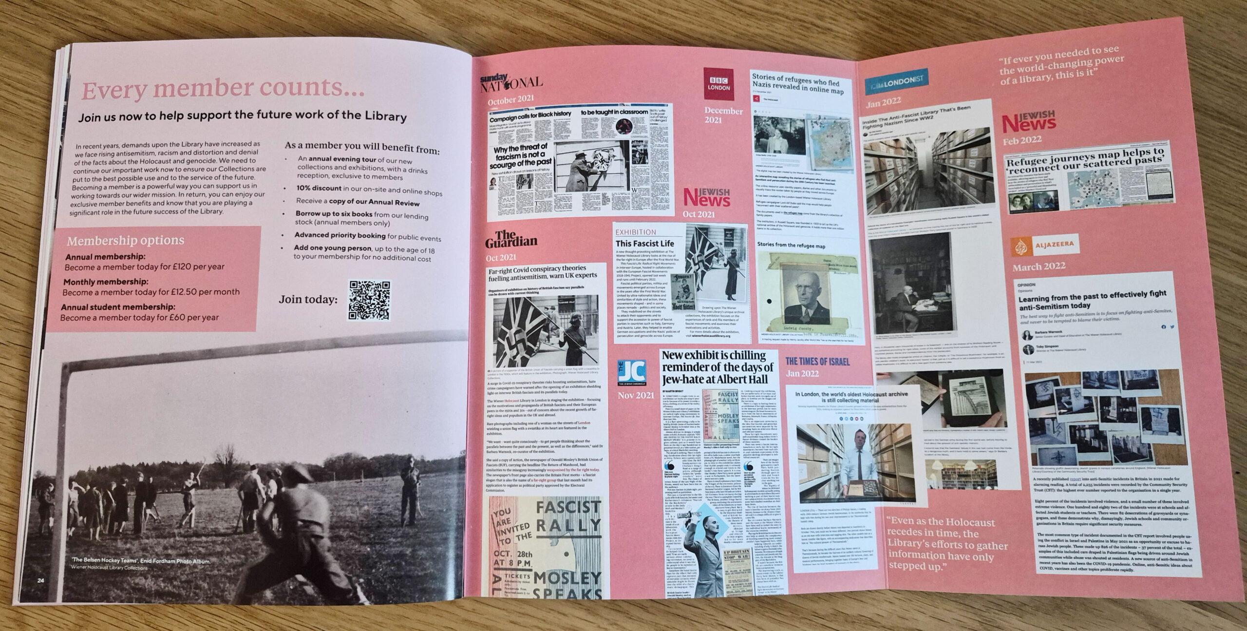
The Wiener Holocaust Library’s 2021-22 Annual Review was inspired by their extensive photographic collection and recent exhibitions.
Throughout the brochure, a ‘focal ring’ is used as a device to highlight text and images, with lines cutting though the layout, lending it movement, rhythm and flow. Larger in format than the previous year’s Review, the cover is printed on uncoated stock, with smooth, silk inners to show off the photographic imagery.
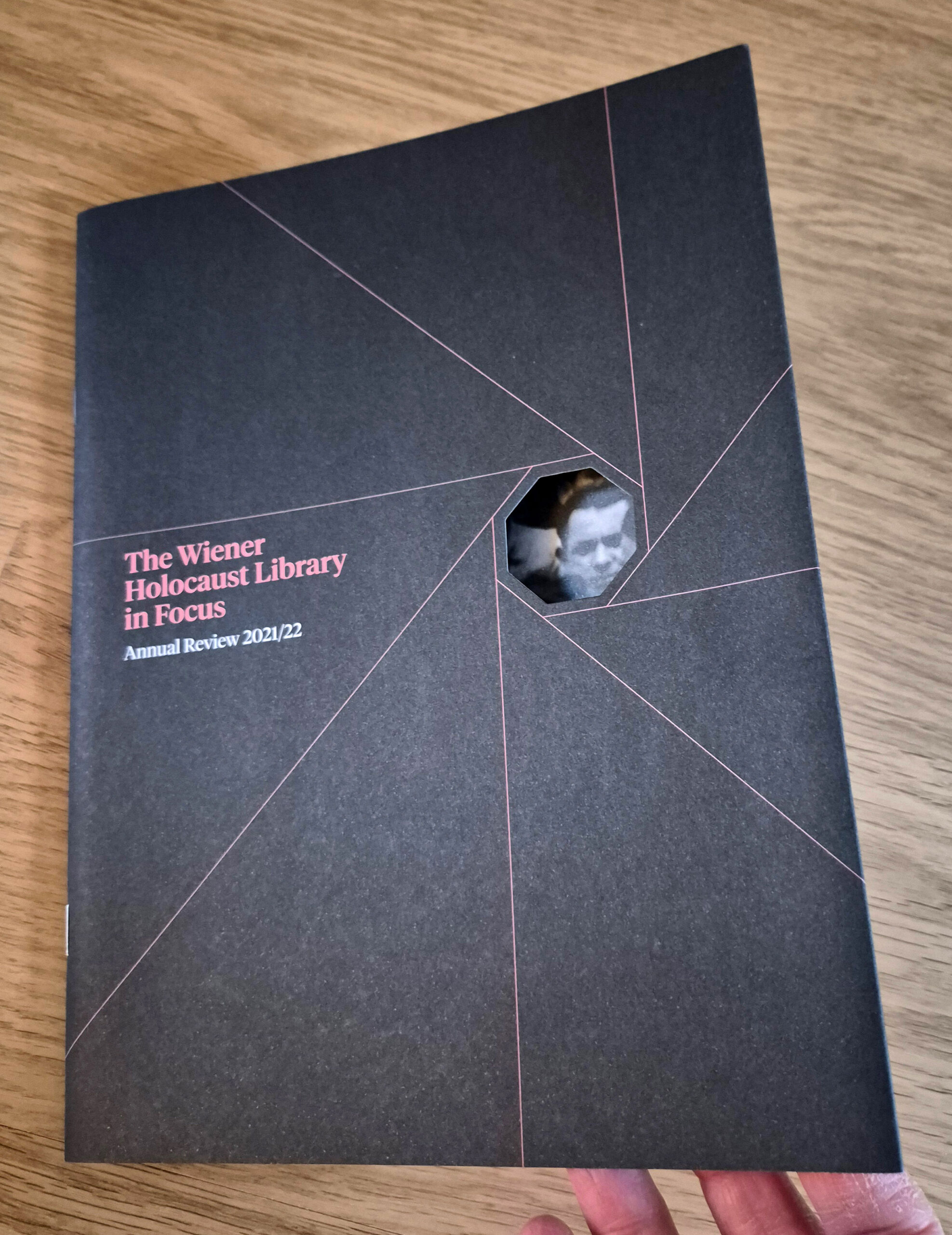
Front cover showing cut-out and reveal


………………
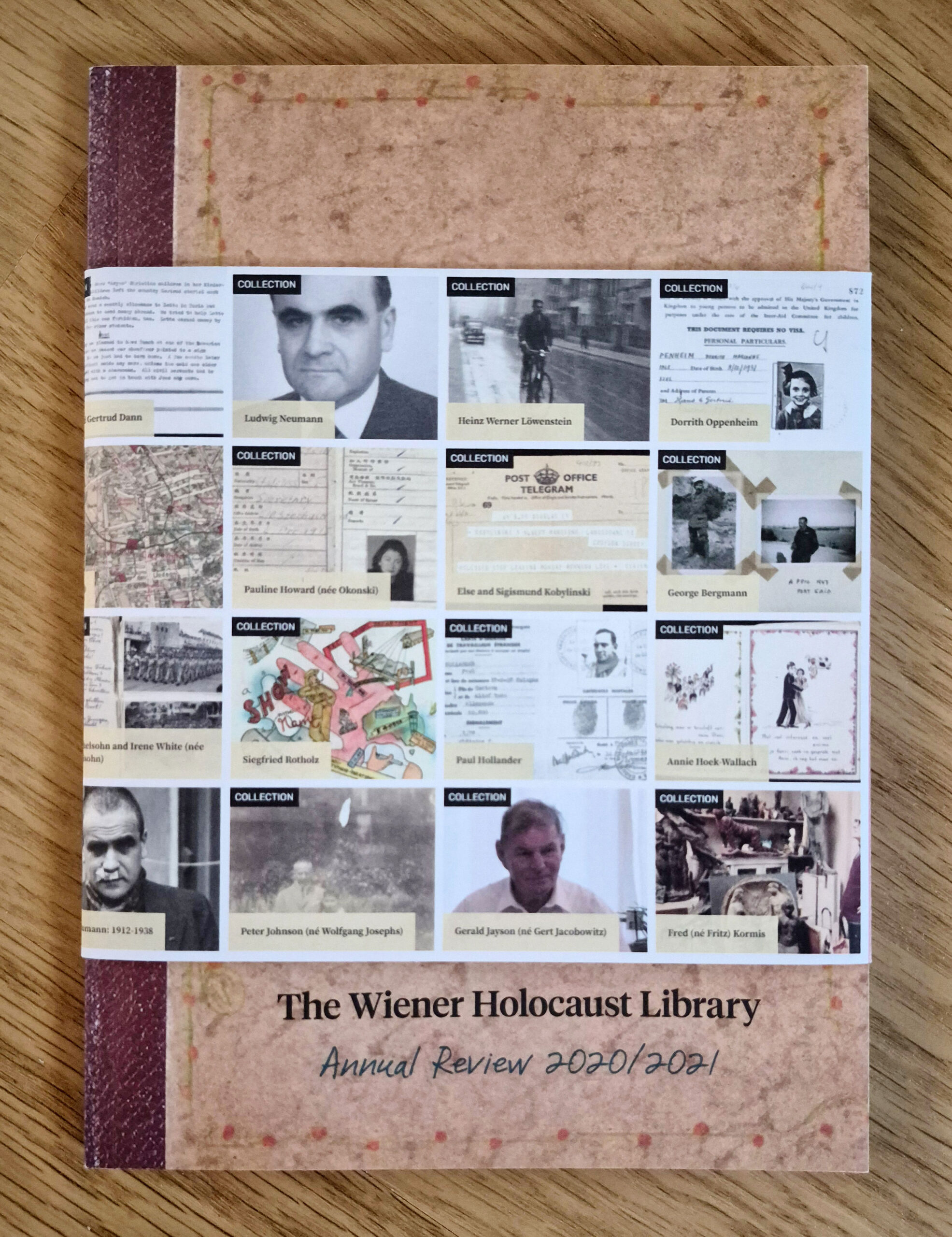
2020–21
The Wiener Holocaust Library’s 2020-21 Annual Review was inspired by their wonderful Poesiealbums (poetry albums full of thoughts and scrap-booked images, that friends and family write in).
Designed to feel like a precious and personal object, the Review is A5 in size, perfect bound and wrapped in a fold-out pamphlet advertising their new online Refugee Map resource.


………………
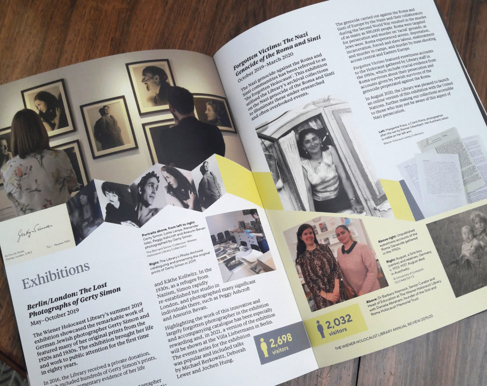
2019–20
During the 2020 Covid-19 lockdowns, Bivouac designed an annual review for The Wiener Holocaust Library. It was particularly important for the Library to reach out to funders during the pandemic, so they were keen to produce something special, but not frivolous. We used uncoated stock and avoided fancy finishes, opting instead for a french-folded cover to give the document some rigidity while allowing space for creative timelines. The final document fits nicely in the hand and is very tactile.
The concept has a past/present/future structure, with Covid-19 appearing bang in the centre, as a break from the norm and a period of re-appraisal, damage limitation and planning for the future. A book/arrow motif forms a ‘ribbon’ through the document, linking spreads and covers, holding images and breaking free. Colour changes from yellow to pink. The french-folded covers contain past and future timelines.
The document has been very well received by the Library and their funders and sponsors.
The document was printed and bound by Colour Options.


