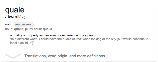
 ‘The ways things seem to us’ and the ‘ineffable’ quality of our sensations. It describes what we think we know, but that may not be how others experience or ‘know’ them.
As an abstract concept, it was fun to wrap the old brain cells around, and the development of the logo, for designer, Richard Mathers took many twists and turns before arriving at its conclusion.
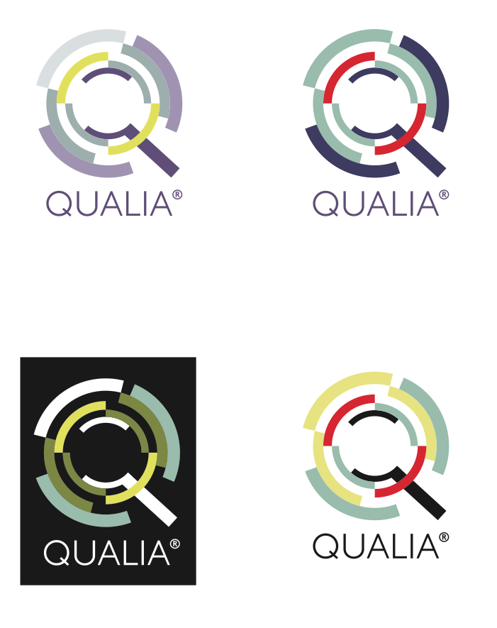
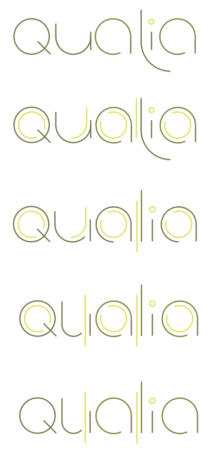
Initially, I explored the idea of moving parts – a logo that could alter and shift and be presented in a number of different permutations. Here are a couple:
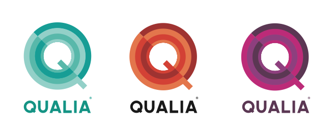
While there were ideas that had potential, they felt a little obvious, so from this, I moved towards a more abstract notion of ‘perception’ – what happens when I take apart a word and force people see and understand it differently?
This logo can be read both ways, split and turned… It is my personal favourite concept and I like the ‘totem’ pattern – the way it can nip around the edge of a page. However, I am not the client, and I will store this idea for later!
It wasn’t right for Richard, and he felt it wasn’t accessible enough for his audiences (fair point), so I started to look at the letterforms again – to slice and look for forms within forms, and to experiment with the weighting of colour and negative spaces.
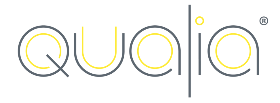
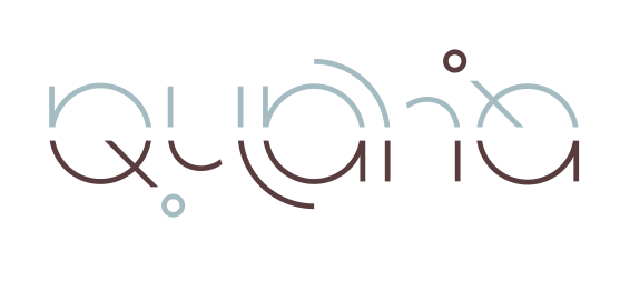
The final logo (below) is a million miles away from the first concepts, but shares a root idea.
Design journeys are often exciting, but this was one I really enjoyed and that took me on a little typographic adventure!
![]()
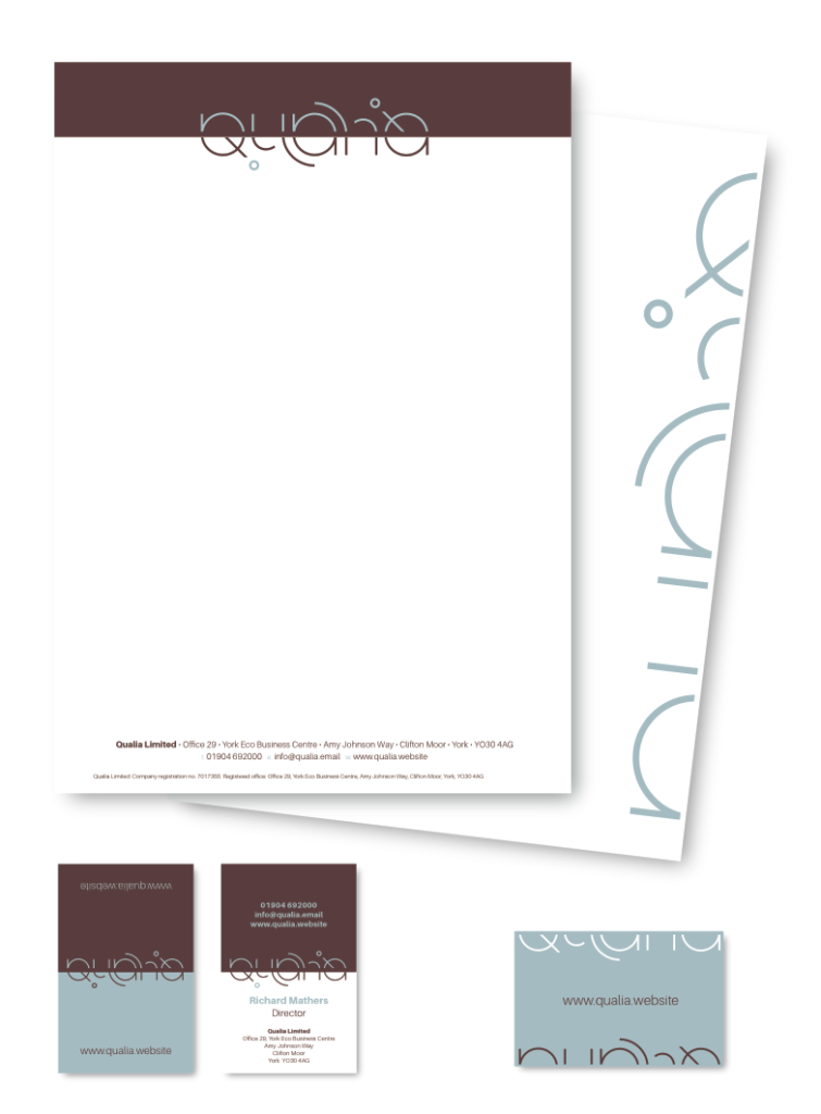
You can see Richard’s design work here.